Challenge
A public-facing data portal published thousands of datasets contributed by dozens of departments. Program leadership knew page-view totals were growing, but couldn't answer the harder questions contributing departments actually cared about: which of our datasets are being used, how does engagement compare to peer ministries, and is the work my team is doing moving the needle.
Approach
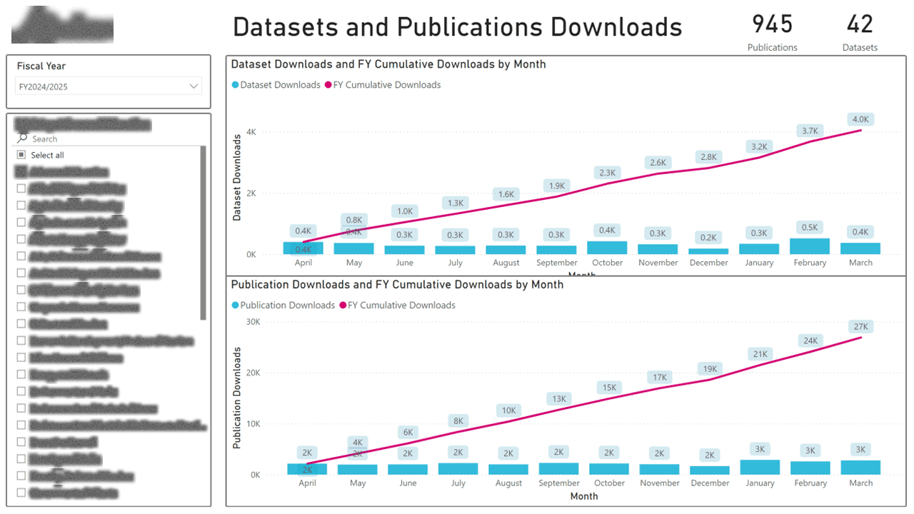
I designed a layered analytics suite. A program-level overview tracks usage, growth, and the top 25 assets. Below that, a per-ministry dashboard gives each contributing department the same metrics scoped to just their content, plus a team-activity view so managers can see whether publishing effort correlates with engagement. The dashboard went through three iterations (2.0 → 4.0) as we learned which views were actually used and which were noise.
Outcome
Contributing departments now have their own dashboard they pull themselves, instead of asking the program team for a one-off slide. Program leadership uses the top-25 and growth views to direct promotional effort. The iterative redesign (4.0 is meaningfully simpler than 2.0) is itself a case study in how dashboards earn trust by shedding features.


